elements to embrace/ timeless design is just a catchphrase
I’m probably biased but I’m really not a fan of designers that boast ‘timeless design.’ I believe that the best design is a smooth incorporation of all the stuff you love, the colors you love and a healthy dose of functionality. This is just as true for retail design as it is for residential. The reason ‘timeless’ doesn’t play well with me is that in my life I change my likes and dislikes pretty frequently. (check my hairstyles over the years and you’ll see what I mean.) I know my design style changes too. I don’t need the pressure of picking out a sofa that I’m supposed to love forever and ever. I want a sofa that can heal a kid with a cold, Friday night family movie nights and all the dog hair. I don’t need to fuss with the pillows or love it forever. A few years will be just enough, thanks.
So my design picks are simply about useful concepts and elements that maybe we haven’t explored yet. A fresh idea that resonates with me and some other design professionals and maybe you? Elements to embrace.
Lighting:
I could talk about lighting for days.
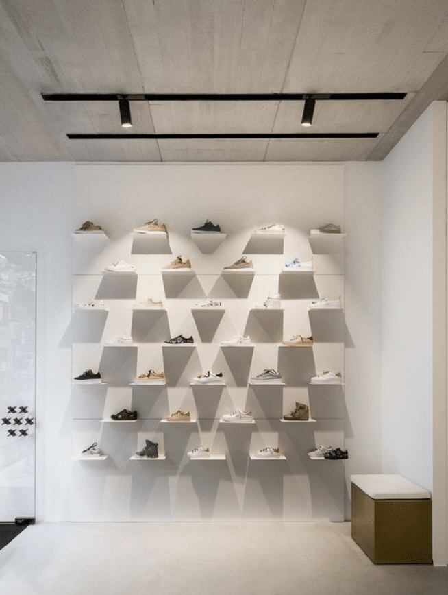
- Continued emphasis on energy-efficient and customizable LED lighting solutions for highlighting products and creating ambiance. Watching those color temperatures so that spaces intentionally feel cold and fresh or warm and cozy.
- Human-Centric Lighting: Incorporating lighting designs that mimic natural light patterns to enhance the shopping experience and well-being of customers. This is so important especially in the northern US where winter is lacking the light we need to stay happy. Remember, Happy customers = higher spending habits.
- Interactive Lighting: Using smart lighting systems that respond to customer movements or engage with interactive displays. It’s like a visual hello when a light pops on in front of a display when you walk by & instant enga

Color:
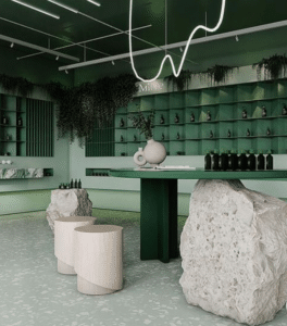
- Biophilic (bringing the outside inside) Colors: Earthy tones and nature-inspired palettes to create a connection with the outdoors. They’re a great source of calm for folks with anxiety too. Earthy doesn’t mean boring either. I recently designed a space inspired by canyon colors.
- Monochromatic Schemes: Minimalist and sleek designs featuring varying shades of a single color for a modern and cohesive look. The trick to making these spaces sing is varying textures. Monochromatic textures. They add interest to the space without the addition of more color. MonoC schemes do not have to be neutral. I love a stunning, head to toe, deep inky space.
Simply Good Design:
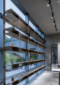
- Mix of Materials: Combining different textures and materials, like metal, wood, and glass, to add visual interest and depth. This mix is so commonly lost in retail interiors. In a salon or boutique, we have so many hard surfaces it’s easy to forget about a healthy dose of textures. Guess what else? You can mix your metals. Just because your door hardware is brass doesn’t mean everything has to matchy match. In fact, it looks better when you don’t!
- Flexible Store Layouts: Adaptable layouts that can be easily rearranged to accommodate changing product displays and customer preferences. There will be anchor fixtures that can’t move and that’s ok too. I do love basic tables and units that can be moved and shifted depending on the season or the traffic forecast. Maybe you can sell more merch in the winter, so add a stunning display and sell more merch.
- Bringing the Outdoors In: Integrating natural elements like plants and greenery into the design for a fresh and inviting atmosphere. Not everyone has the natural light or green thumb to grow indoor plants in a retail store, but I love some artificials that look so real you may accidentally water them. (Hey dispensaries- SELL CLONES if you can!) We love seeing and trying our hand at those beautiful babies.

