logos that stick

When I started Blackdog, I decided to rebrand and refresh the company. I wanted a new identity. All mine. In retrospect it was a risky move. I was already a well established retail dispensary design company. I thought long and hard about it and realized that the key factor to the success of my previous company, as well as the potential of my new company was actually me, not the name on the website.
I can brand it however I want. And I wanted to have some fun with it.
Spoiler: It wasn’t fun. 😯
It took me longer to land on a final brand bible than it did for me to name all three of my kids. I poured over countless iterations of the logo, color palette and fonts. I asked the opinions of anyone who would listen. Drew stuff on napkins. Interviewed about 10 graphic designers….And I have a bachelors degree in fine arts alongside 20 years in the interior design industry. I absolutely overthought every aspect of it.
How is a non-artistic business owner able to detangle?
Or maybe you know what you like, but it’s hard to convey.
I frequently weigh in on my clients’ logos while they’re in the thick of the process. I can feel their stress and fully understand how they want to do it right the first time. It can be pricey. The decision of a final brand palette and logo feels like it needs to be permanent. Not something you want to re-do in a few years, and super important for new brands to solidify investors, permits, city approvals. My clients realize that the branding they set forth on day one will be an important identifier for their customers. It’s a weighty decision.
When I review potential logo and branding work, I am looking at it from two perspectives. First (and possibly most importantly) as a human and potential customer.
From this pov, I’m looking for a few things
Is it clear?
Does the logo accurately reflect the shopping experience/product and service level I’m about to experience.
Do I connect to this?
This part is less about if I personally ‘like’ it, and more about would this make me curious enough to want to step inside. On a deeper level, do I WANT to connect to this? See more?
The second lens I use when evaluating a logo or brand book is that of a retail designer.
Will this enhance the branded merch?
There are incentives to selling branded merch. Since advertising dispensaries is a no-no, merch is a walking advertisement that your customer pays for. It’s a no brainer really BUT if the logo/colors are not on par, they stock will sit unsold. I visualize everything on a big ass coffee tumbler, hats & hoodies. Does it work? Would I buy that?
How can this be a focal point in the store?
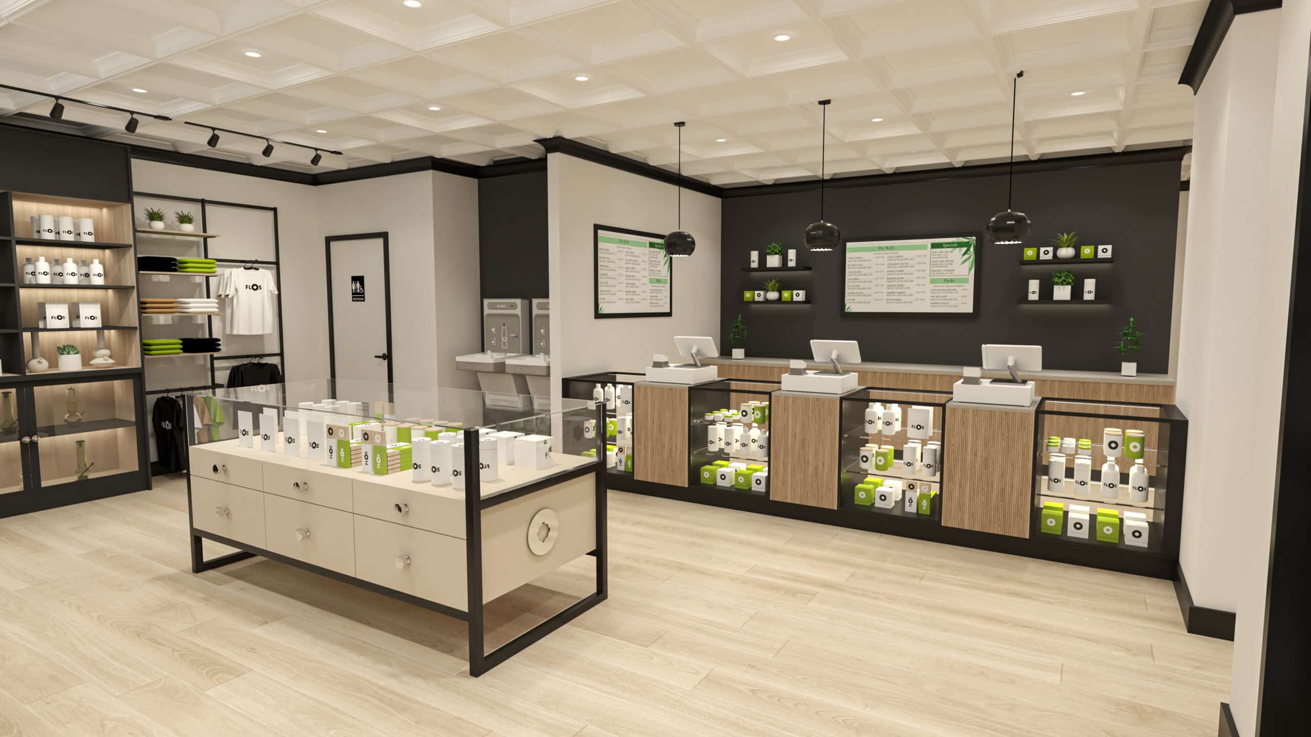
As a dispensary designer, I love sneaking the brand logo in for reinforcement. Its important for the customer to connect the experience to the brand, aka, logo recognition. Typically, I like to have at least one application of the logo where it is blatant. Name. Icon. Colorstory. This can be behind a desk, embedded into the floor, on the wall.
And then I also like to mess with it a bit in an artistic, creative way. Sometimes this means taking the icon and turning it into a piece of art, pop art/graffiti/abstract interpretation. I’ve even created custom pendant lights with the icon etched into the glass. So its subtle, but there.
If a presented logo or color story isn’t hitting on these points, I like to evaluate exactly where it missed the mark.
Usually, it doesn’t work for one of these reasons:
- Too complicated
- Too cartoony
- Contradictory to the Name/VIbe/Customer
- Looks like a copycat of someone else
Even with my years of typography, BA in fine arts, 20 years in the design world, I knew I couldn’t design this myself. It was almost like I was too close to it. Too in the trenches if that makes sense. So I had two choices, either an online crowdsource style format, or interview and hire a graphic designer or total DIY.
I’ve had plenty of clients go the online route. 99designs.com has actually created a few great ones for previous clients. My advice if you choose this route is to NARROW IT DOWN and lay out a direction before you go for it. So you can advise them. I dislike red. I like scripty fonts. I want to see a cannabis leaf and an exclamation point in the design. The more specifics you can lay out early, the easier and more on-target their responses will be.
Sometimes you don’t really know what you like. OR you’ve got a team that all needs to weigh in on the logo and branding decisions. In this case, I would recommend hiring a graphic designer pro. This is the path I chose. I’m very glad I did. My graphic designer was able to decode my likes by asking indepth questions and probing into the why I like what I do. He went above and beyond in creating an additional icon which taps into not only blackdog, but me being one of the OG dispensary designers out there, and my sense of humor.
I also appreciated that the graphic designer would think of things beyond what I thought I needed. Developing things like proposal letter heads/templates for newsletters etc. Now I have a go-to brand kit that saves me tons of time and energy. I love that my brand kit is professional but also suits my personality, design philosophy and incorporates my big, dumb, loving, dog.
Even after hiring a pro, I had to run it through some success metrics. These are some of the basics that all successful logos and brands follow.
- It’s simple. It’s easy to fall into the trap of thinking that your logo needs to be complex, but the best logos are often the most simple. And also look great not only in your brand colors, but one color white or black.
- It’s memorable. You know how advertisers evaluate the success of a commercial? If the viewer can tell you the brand. Not the catch phrase, not the celebrity endorser. If the viewer can’t tell you that hilarious superbowl commercial was for Fidelity Investments, the commercial is not successful. Full Stop.
- It’s timeless. You’re not going to hate it in 5 years. It doesn’t stick solely to a trend. If the icon & typography is great, could you recolor it down the road if needed?
- It’s relevant. The logo and brand kit speaks to who you are, what you do, and is logically connected to the products you sell. If you saw it etched into a door glass, you could probably figure out what kind of store you’re entering.
- Its original. I cannot count the number of times a client proudly shows me a logo they’re considering and it’s a direct rip off of a big brand. Guess how this impacts brand trust with your customer? Just don’t.
So if you’ve got a few ideas on the table, run them through the lenses I shared. It will help you create a successful brand kit with less frustration.
Did you know I’m happy to consult on everything from signage to logos? Having a unique insider view of the cannabis industry, and retail designer to over 100 brands is a great asset in helping you come to that final logo yes. I’m happy to share my insights and feedback.
Tips for hiring a graphic designer
These are a few things I learned on the fly when I was on the hunt for a great designer.
- Portfolio. It’s less important for you to love everything in someone’s project tab, but at least one or two that strike you and you like. Seeing a wide range of styles is a good thing too.
- Ask Questions.
- What inspires you?
- Can you price ala carte?
- What are your typical timelines?
- What do you do if my team and i can’t agree?
- How many edits do I get?
- What is your communication after you’ve designed it? (What if i need more help?)
- What software do you use?
- What formats will I receive everything in?
- Can you walk me through your design process?
