higher focus & dissolving distractions

When you’re watching tv and a commercial comes on, if you don’t later remember the brand being featured, the commercial was not successful from an advertising & marketing point of view. There is a clear reason why it’s “Jake from State Farm” and not just “Jake. “
In-store displays work the same way.
The line between a successful display, and a purely decorative feature can be blurry to the customer. Which means it’s not doing its primary job.
The only true way to measure if the dollars were well spent is… well… are we selling more products, encouraging repeat customers and getting some traction on socials? Sensory overload in-store is not the path to higher ticket sales.
To make your shopping experience a success, eliminate the chaos and try dialing back the distractions. This includes digital signage, too many product info cards, overloaded displays and product groupings that aren’t easy to navigate.
People don’t read signage for more than two seconds. Digital screens, product info cards and QR codes… they can look junky and more, asking your customers to read or scan multiple times to make a purchase is annoying to them. Opt for farm footage loops, interesting product highlights and simple verbiage. Amp up your budtender’s knowledgeable interactions for a more personalized shopping journey. Encourage connection and ditch the cop out signage. People don’t read stuff. Task mindset.
“Our research shows that typically between 15-20% of signs are noticed. So how do we explain this from a behavioral standpoint? The main reason is that shoppers often have a task based mindset and there is typically cognitive overload in the retail environment. Shoppers are not reading while they are shopping and on a typical shopping trip less than 20 words are read. Complex signage should be avoided as it delivers low engagement. When we test complex signage, we typically see the highest levels of avoidance behavior. Complex messaging is best left to packages where customers “trust” brands and are more receptive to product information and comparisons.” Explorer research, 2/2025
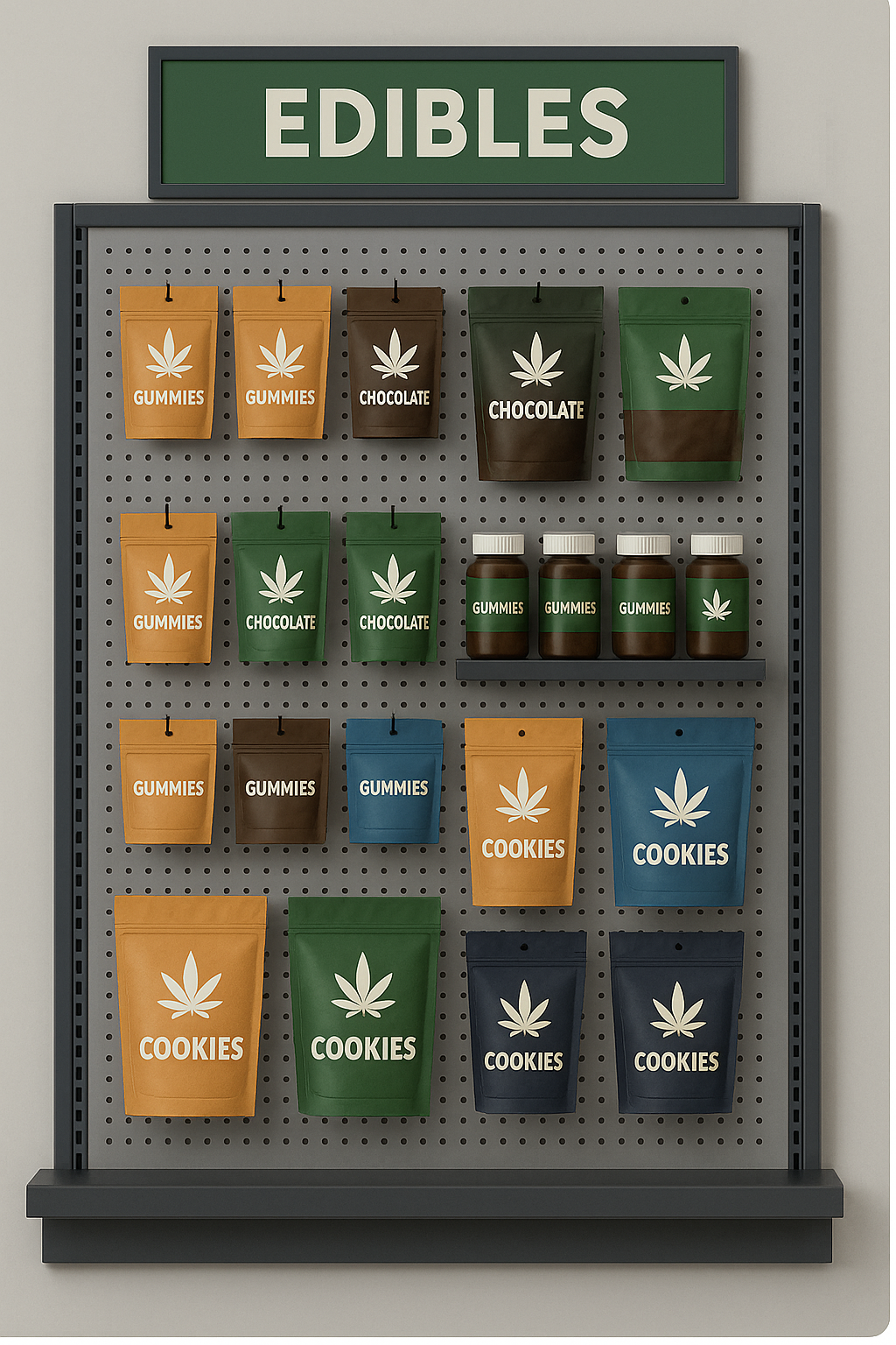
Intuitive product organization. Know what’s also super annoying as a customer? Brand grouped products. When I’m shopping for a new type of supplement, vitamin, or self care product. I’m focused on how I want to feel after I try it. Cute packaging is always a bonus and if I recognize the brand, great. But it’s not intuitive to think customers will sort through all of a brand’s many sku’s to figure out which one will be great for a post workout recovery, or a Thursday night out with the girls. Group products by product type or even better, desired end result AND type. (sleep, wellness, focus, alert etc.) Make shopping easier. This also opens the door for additional unintended purchases and higher ticket sales.
Value perception. Anyone can create this within their retail store by simply stocking the shelves in a thoughtful way. Customers will perceive higher value of any product if the shelves are not overloaded with backstock (even if it’s empty packaging.) They will naturally pay a little more for something they believe to be of higher quality or higher demand. The absolute best way to do this is to create a plan-o-gram for each of your displays. Your employees will know exactly where each product goes as well as how many of each should be displayed. Your displays will look clean, organized and inviting.
We frequently create these plans for our customers who want a cohesive, standardized look to all of their locations. Having a plan in place takes the guesswork out of merchandising for your employees and allows you to tract product sales success easily.


